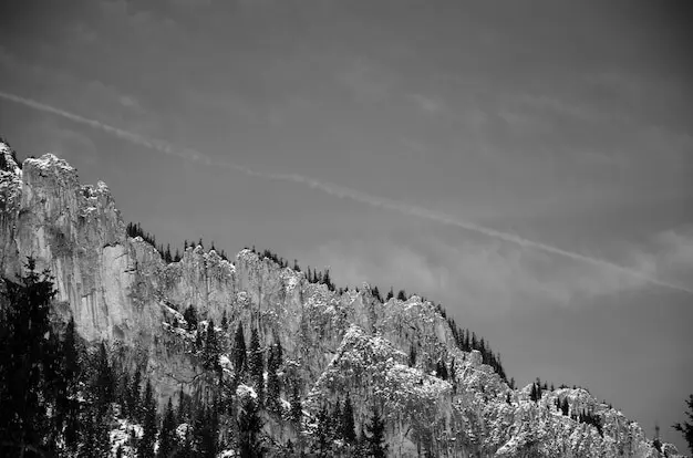


Hold a small tool in gentle motion, never freezing at an edge. Count softly, breathe evenly, and watch the glow accumulate without breaking the ridge’s calligraphy. A fraction less is often enough; restraint avoids cardboard theatrics. Over multiple prints, refine timing until your fingers memorize the mountain’s inflections, transforming technique into touch that feels inevitable, humble, and quietly precise.
Snow welcomes subtlety, not force. Consider pre‑flashing to raise paper threshold, then add brief, diffused burns that respect crystal microstructure. Work from edges inward, careful not to gray the heart of a drift. If sparkle falters, step back rather than push harder. The goal is convincing substance, not theatrical drama, preserving negative space as a textured presence rather than a blank syllable.
One February, a narrow ridge appeared and vanished between gusts. I learned to meter quickly, trusting a single reading and a calm frame. Later, burns along the leeward slope rebuilt the wind I remembered. The final print holds fewer details than the scene, yet somehow more of its weather, inviting viewers to feel the pause before the next gust tightened every muscle.
In the darkroom, I sometimes hear the river that shaped those valleys, a steady hush encouraging slower agitation and a kinder development curve. Selenium deepened mids like cold water around ankles, while untoned whites stayed buoyant. The print’s rhythm followed that remembered current, convincing me that fidelity isn’t mimicry; it is conversation between landscape, emulsion, and whatever patience you can muster.
Back home, contact sheets became maps of barometric pressure and timing, annotated with arrows, circles, and clipped phrases. I pulled work prints where wind shaped cloud edges or snow reflected into shadowed gullies. With each iteration, edits grew quieter, more certain. The sequence ultimately felt like a long inhale, then a careful release, honoring the Alps without exhausting their comfortable, formidable distance.

Fiber papers demand generous water, tested for residual fixer to protect your luminous whites. Selenium or gold toning guards the image while subtly shaping tonality. Dry slowly to keep surfaces calm and flat. This is steadiness, not spectacle, the unglamorous care that lets alpine quiet survive seasons, travel, and warm hands, so future viewers can enter the same hush you carefully nurtured.
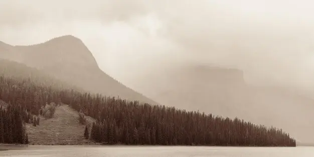
An ample overmat echoes the spaciousness within the image, giving sky and snow continuity beyond the frame. Choose rag boards that won’t compete with highlight color, and align window proportions with the print’s internal cadence. Whether hinging or dry mounting, keep horizons level, corners crisp, and notes recorded. Presentation becomes the final contour line, locating the print clearly in a room’s attention.

Invite dialogue by posting work prints, contact sheets, and process notes, not only polished finals. Ask readers which intervals of quiet move them, and consider a mailing list for release announcements, workshops, or print exchanges. Feedback shapes future decisions and builds shared language around silver, space, and mountains. The Alps grow larger when many eyes breathe with them, together, patiently, in luminous silence.
All Rights Reserved.